Reviewing our website structure
We're reviewing the structure of our website and we want residents to have their say.
Our survey is now closed.
Back in August 2021 we shared a blog post about our Review and Renew project which explained how we're aiming to improve our site.
Since then, we've been continuing to review and update the content, as well as reorganising it and applying our new design (as you can see across the website!).
However, we've now reached a point in the project where we need to re-consider the structure for the entire website, thinking about where our users will expect to find certain topics and how we can make it easier to navigate.
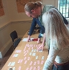
So far, we've used our analytics data to review how people use our site and undertaken a card sorting exercise with staff.

We know that lots of our users come directly to the page they're looking for via Google, whilst some users search for what they want from our home page. But whatever route users take, we need to make sure that the content is easy to navigate, whether that's from the home page or from any other page on the site.
After combining the information we gathered from data and feedback, we've come up with a proposed new structure that we want residents to have their say on. So, we've produced a survey to ask you what you think, as well as to further understand how you use our site.
Our was live from 17th May to 14th June.
If you'd like to give us website feedback or let us know about a specific issue, you can use our 'How Did We Do?' online form. Please specify which page you're having trouble with and how you think we can improve it.


